The graph shows four areas of accommodation status in a major European city from 1970 to 2000. Summarize the information by selecting and reporting the main features, and make comparisons where relevant.
Sample Answer of The Graph Shows Four Areas of Accommodation Status in a Major European
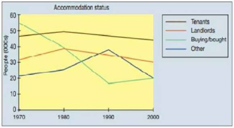
The line graph depicts the situation of four diverse living quarters in a European city between 1970 and 2000.
In 1970 there were around 31 per cent landlords later, a slight increment was observed, which decreased after a decade. Whereas there was almost 15 per cent, more people were tenants in a Europe which was later decrease up to 43 per cent in 2000. On the other side, there were nearly 20 per cent fewer landlords were there.
Furthermore, In 1970 the ratio of bought houses was at the peak which was almost 55 per cent in which a drastic decrease was noticed within the next two decades, which fall up to 40 per cent later there was a negligence increase observed which was around 3 per cent. On the other hand, in other housings, there was fluctuation seen which increased after 1980 and again fell after a decade, almost 20 per cent in 2000.
Overall, the ratio of bought shelter was at peek initially; later, it was noticed at minimum as compared to others.
Discover more from IELTS Fever
Subscribe to get the latest posts sent to your email.