The graph shows the average annual expenditure on cell phones and residential phone services. Summarise the information by selecting and reporting the main features and making relevant comparisons.
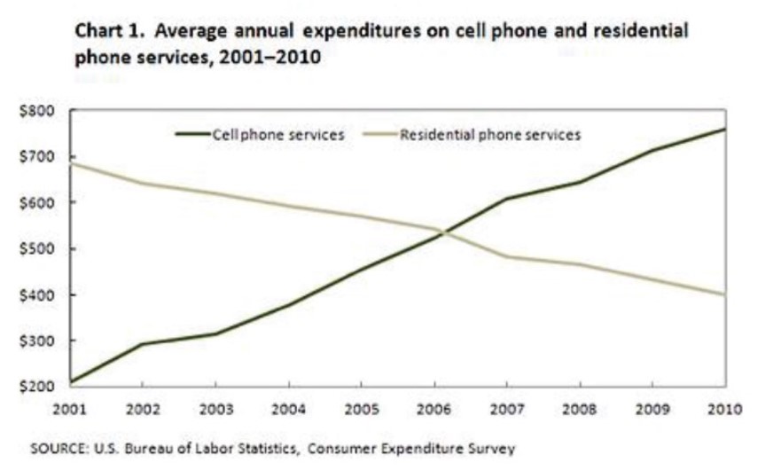
The line graph illustrates the amount of money spent on mobile and residential phone services yearly within a given decade(from 2001 to 2010) in the US as conducted by the Bureau of labour services.
From the image, it is immediately apparent that the use of cell phones surged as the years went by, while that of home phones became unpopular, as evidenced by the income generated.
In the beginning year 2001, 200 dollars was spent on mobile phones compared to 700dollars on resident phones, indicating that mobile phones were not in massive use then. However, the narrative changed in 2002 as consumers started becoming accustomed to cell phones and residential phones took a plummeting turn.
By the year 2006, according to the survey, mobile phone service returns were seen to have reached the same level as home phones which was about 550dollars at that time.
After that year, the income from residential phone services kept on with the steady decline whilst that of mobile inflated.
Lastly, hypothetically, by the end of 2010, due to the popular use of cell phone services, its expenditure reached 750dollars while residential phones significantly declined to 300 dollars.
Follow Us on IELTSFever Twitter for more updates
Discover more from IELTS Fever
Subscribe to get the latest posts sent to your email.