The Graphs Below Provide Information on Global Population Figures and Figures for Urban Populations in Different World Regions. Summarise the Information by Selecting and Reporting the Main Features, and Make Comparisons Where Relevant.
Sample Answer: The Graphs Below Provide Information on Global Population Figures and Figures
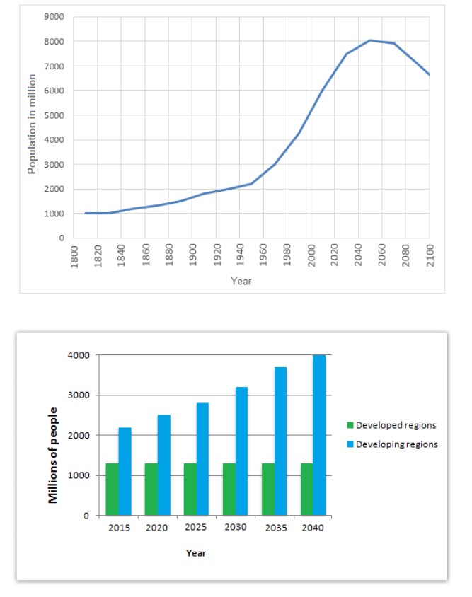
The line graph demonstrates the details about the worldwide population from 1800 to 2100. The bar graph compares the information on urban population between developing and developed regions from 2015 to 2040. Units are measured in millions.
Overall, there is a considerable increase in the world population over the given period of time. Although there is a significant growth of residents in developing countries, the number of people in developed countries remains at the same level throughout the entire time.
Back in 1820 the population was very low at 1000, from 1830 to 1940 there was a minimal amount of citizens within the planet earth at just above 1000 and slightly above 2000 respectively, furthermore the population increased massively from 1945 at little above 1000 and expected to reach 8000 in next 105 years, and the population will decrease to just under 7000 in 2100.
Despite the developed areas maintaining the same population from 2015 up to 2040, with more than 1000 people, on the other hand, the developing states began with just greater than 2000 people in 2015 and are predicted to peak at 4000 people in 2040.
Discover more from IELTS Fever
Subscribe to get the latest posts sent to your email.