The line graph shows visits to and from the UK from 1979 to 1999, and the bar graph shows the most popular countries visited by UK residents in 1999. Summarize the information by selecting and reporting the main features and make comparisons where relevant.
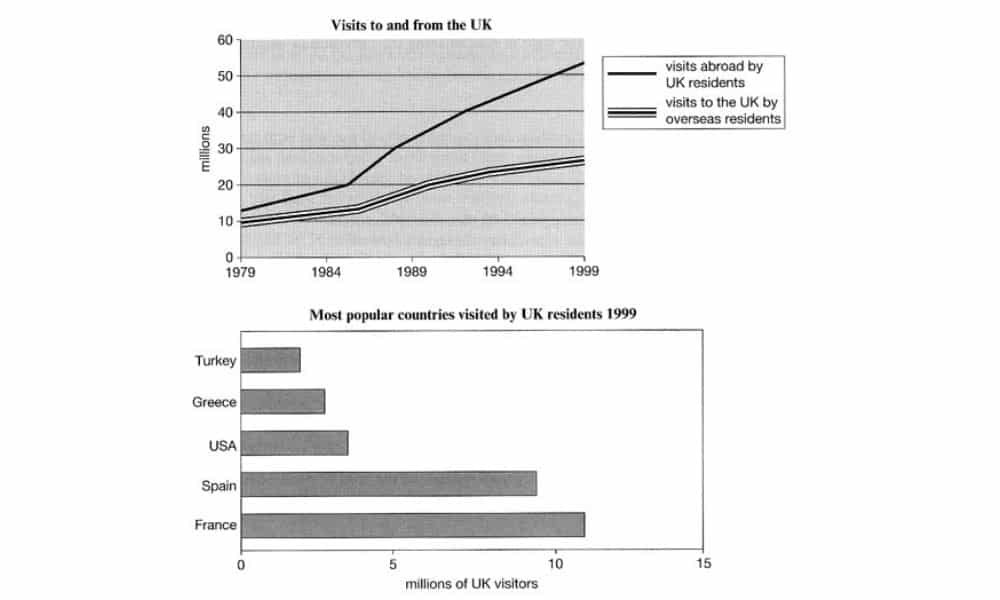
The following line diagram depicts trips to and from Great Britain in a 20-year span, and the bar chart provides the information on most visited nations by UK residents in 1999. Overall, visits abroad by UK residents have overseen a massive increase compared to the otherwise. On the other hand, the most popular nations visited by UK residents are dominated by countries from Europe.
In the line graph, the initial counts of visits by UK residents abroad and vice versa started initially with 10 million visits each in 1979. Over the years, the trend distinguished differently. Between 1979 to 1999 the visits abroad by Great Britain citizens rose significantly. By 1999, the number of visits quadrupled compared with the twenty-year prior. On the other hand, the number of journeys by UK residents abroad only doubled by 1999.
The next graph shows that there are five countries listed as the most popular destinations for Great Britain citizens. Four countries come from Europe, and the other one hailed from North America. France is the most visited nation with over 11 million UK visitors, followed closely by Spain with 9 million trips. Their European compatriots, Turkey and Greece, amassed about 2 and 3 million journeys, respectively. At the same time, United States notched a respectable 4 million visits considering their geographical range from the UK. Their 4 million visits, if totalled those with those South European countries, are still a bit shy of French’s 11 million visits.
If those two graphs were compared, the massive number of visits abroad by UK residents in the former might be affected by a large number of visits to European and North American nations in the latter. Other than that, the most noticeable comparison is the second chart’s total of visits still higher than first graph’s visits to England, Northern Ireland, Wales, and Scotland by citizens from another country.
Follow Us on IELTSFever Instagram for more updates and the latest test tasks.
Also, Read The Chart Below Shows the Global Sales
Discover more from IELTS Fever
Subscribe to get the latest posts sent to your email.