The Pie Charts Below Show the Percentage of Housing Owned and Rented in The Uk in 1991 and 2007. Summarize the Information by Describing the Main Features of The Charts and Making Comparisons Where Appropriate.
 The two pie charts illustrate the proportions of housing owned and rented in the United Kingdom in 1991 and 2007. Overall, it is clear that home ownership increased significantly over the period, while the proportion of social renting and social housing declined.
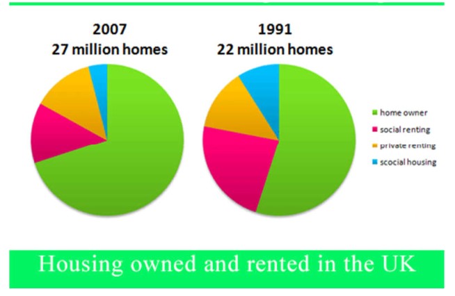
In 1991, there were 22 million homes in the UK. The majority of these —about 60% —were owned by their occupants. Social renting accounted for approximately 23%, while private renting represented 11%. The smallest category was social housing, making up only 6% of the total homes.
By 2007, the total number of homes had increased to 27 million, showing overall housing growth. The homeownership rate rose to 70%, indicating that more people were able to buy their own property. Meanwhile, social renting fell to 17%, and social housing almost halved to just 2%, suggesting a shift away from government-provided accommodation. Interestingly, private renting rose slightly to 11%, remaining stable compared to 1991.
Overall, between 1991 and 2007, the UK housing market experienced a clear trend toward greater home ownership, while social and public housing became less common. This change may reflect improvements in living standards, government housing policies, and easier access to mortgage facilities during this period.
Follow us on the IELTSFever YouTube channel for IELTS Exam Prediction
Discover more from IELTS Fever
Subscribe to get the latest posts sent to your email.