The Pie Charts Below Show the Percentage of Housing Owned and rented in the UK in 1991 and 2007. Summarize the information by describing the main features of the charts and making comparisons where appropriate.
Summarise the information by selecting and reporting the main features and make comparisons where relevant. Write at least 150 words.
Sample Answer of The Pie Charts Below Show the Percentage of Housing Owned
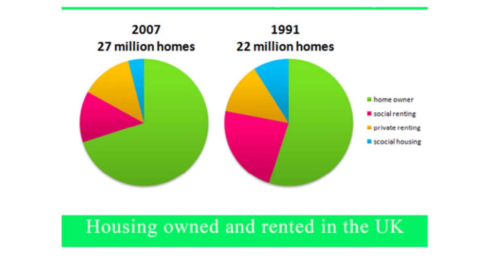
The given Pie Charts depict the percentage of accommodation in terms of owned and rented in Great Britain in the two specific years:1991 and 2007.
In 1991, owned homes were obtained highest proportion than any other types of accommodation, with just over a half(55%). And In 2007, the trend was similar for owned homes, which constituted a significant proportion just below three-quarters(70%). In contrast, the rate of social housing in 1991 was only 10 %; however, it was decreased in 2007 by a tiny fraction (5%).
Interestingly, the rate of private renting homes was similar in both the years, which constituted roughly 15 percentage. In 1991, the percentage of Social renting home was second highest after the homeowner, which was 25%, whilst in the year of 2007, the numbers decreased slightly by 10%.
Overall, It can say that the number of houses was increased from 22 million in 1999 to 27 million in 2007. In the UK number of house owners was high in both the given years. But, inhabitants were not preferred to live in social houses.
Discover more from IELTS Fever
Subscribe to get the latest posts sent to your email.
Great teaching method, i’m delighted to here