The pie charts compare the expenditure of a school in the UK in three different years over a 20- year period. Summarize the information by selecting and reporting the main features, and make comparisons where relevant.
Sample Answer of The Pie Charts Compare the Expenditure of a School in the Uk
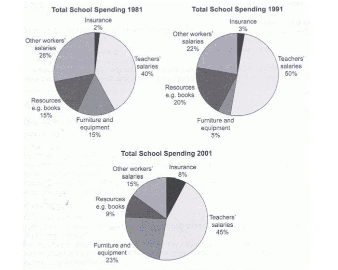
These three pie charts show the expenses of a school in the UK in three subsequent years over a 20-year period.
Firstly, it can be seen that the vast majority of the expenditure was on teacher’s salaries. The insurance got the smallest pay in the three different years as well as the resources.
On the other hand, expenditure o furniture and types of equipment in 1981 and 2001 was high, dropping to five per cent in 1991. These could also be seen in 1981 to 1991 where expenses on other workers salaries were high, but in 2001 the expenses on other workers salaries were on the low side.
In conclusion, it is noticeable that the school expenses was more on the teacher’s salaries and a minimal amount spent on insurance for the three different years.
Follow Us on IELTSFever Instagram for more updates and the latest test tasks.
Also, Read The Chart Below Shows the Percentage of Young People in Higher Education
Discover more from IELTS Fever
Subscribe to get the latest posts sent to your email.