


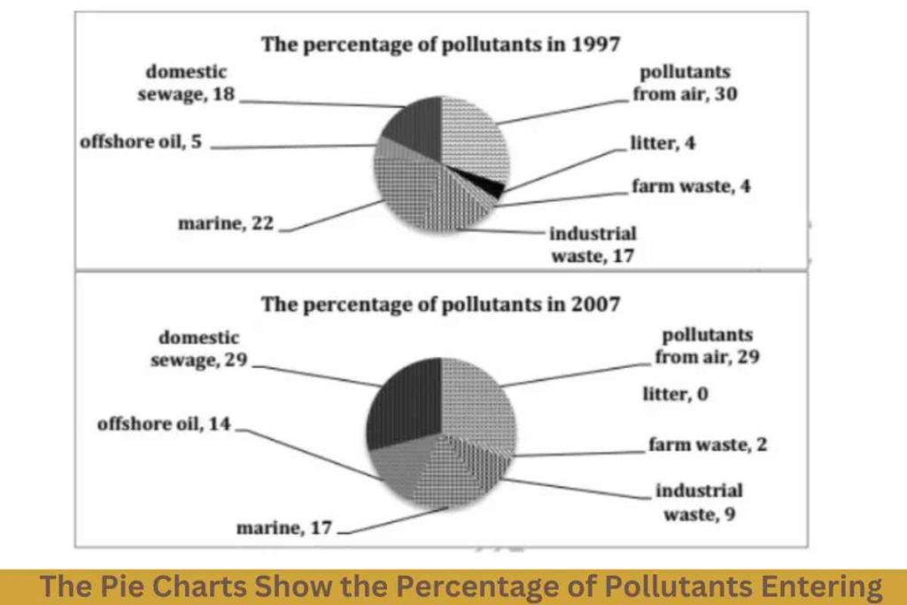


The two pie charts compare the proportion of domestic sewage, offshore oil, marine, litter, farm waste, industrial waste, and air pollutants entering a specific part of the ocean in the years 1997 and 2007. Overall, it is noticeable that the highest pollutants that entered the sea were from air pollutants in both years.
There are several contaminants that have witnessed a decrease over the given years. In 1997, pollutants from air entering the sea was just a quarter. It was the highest compared to other toxins throughout the year 1997. There was just a one percent decrease in pollutants in the air in the year 2007.
Also, waste products from farms were the second most popular, with 22% in 1997. Although it reduced to 5% in 2007. In 1997, there was a reduction in the amount of waste from industry and litter from 17% and 4% to under a ten and a negligible amount respectively.
However, There were only two harmful substances that increased over the given years. Domestic sewage waste rose from only 18% to just under one in ten. While offshore oil increased from 5% to 14%, respectively.
Sample 2:-The Pie Charts Show the Percentage of Pollutants Entering
The pie graphs detail proportions of pollutants which were thrown into the ocean by various categories in the year 1997 and 2007.
From an overall perspective, it is readily apparent that the percentage of pollutants had declined sharply at the end of the given period except for domestic sewage and offshore oil. This field of pollution inversely had soared in one decade.
Looking at 1997, the number of pollutants which occurred by air dominated accounting for 30%, followed by marine waste(22%). At same time, domestic sewage and industrial waste created a similar proportion in the pollution data, respectively 18% and 17%. Considering another category, which is offshore oil, distributed 5%, interestingly, litter and agricultural waste accounted for the same amount of pollutants, 4%.
After ten years, pollutants from the air decreased by one percent. On the other hand, domestic sewage dramatically increased
and matched the figures for air pollutants (29%). For offshore oil, increasing tripled rate and finished at 14%. Additionally, these pollutants showed an increase, with other marine fields dipping by 5%, noticeably pollution by litter had completely periled, while industrial waste and farm waste declined by half rate.
![]()

Sample 3:-The Pie Charts Show the Percentage of Pollutants Entering
The pie charts depict information about the comparison of the proportion of pollutants from different types of sources entered into a certain part of the sea in 1997 and 2007.
Overall, it can be said that the pollutants from air entering the sea were maximum in both years, while the pollutants from farm waste and litter were minimum over the given period.
After analyzing the pie charts, it can be said that the pollutants that went into the ocean from industrial and farm waste were 17% and 4% in the initial year and became nearly half, about 9% and 2% in the next decade. Similarly, the amount of marine pollutants fell significantly from 22% to 17% by 2007. Meanwhile, roughly 4% of pollutants from litter were observed in 1997. However, by the end of the given time period, this amount became 0%.
The pollutants of air remained leveled by nearly 30% over the decade. Although, the contribution of domestic sewage pollutants grew considerably from 18% to 29% by 2007. The pollutants from offshore oil were observed to become three times from 5% to 14% from 1997 to 2007.