The table below shows the proportion of different categories of families living in poverty in Australia in 1999. Summarise the information by selecting and reporting the main features, and make comparisons where relevant.
Sample Answer of The Table Below Shows the Proportion of Different Categories of Families Living
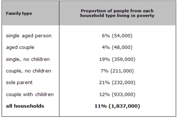
The table illustrates the percentage of various types of families who were living in poverty in Australia in the year 1999.
The sole parent had the highest percentage of share among all types, i.e., 21%, and the population of them is 232,000, followed by 19% who were single with no children. Couples with children had a 12% share, but their population in terms of numbers was highest among all types. Further single aged person, aged couple and couple with no children had almost equal percentages, but the population of couples with no children had around four times more population than a single aged person and aged couple.
Overall, 1,837,000 people were living in poverty among the whole population of Australia. Out of them, couples with children had the highest population in terms of numbers, but in terms of sole share, the parent had the highest one.
Follow Us on IELTSFever Twitter for more updates and the latest news.
Also Read The Bar Charts Below Provide Information About Honey Production
Discover more from IELTS Fever
Subscribe to get the latest posts sent to your email.
Your listening tests are not played full length of audio .