The Graph Below Shows the Consumption of Fish and Some Different Kinds
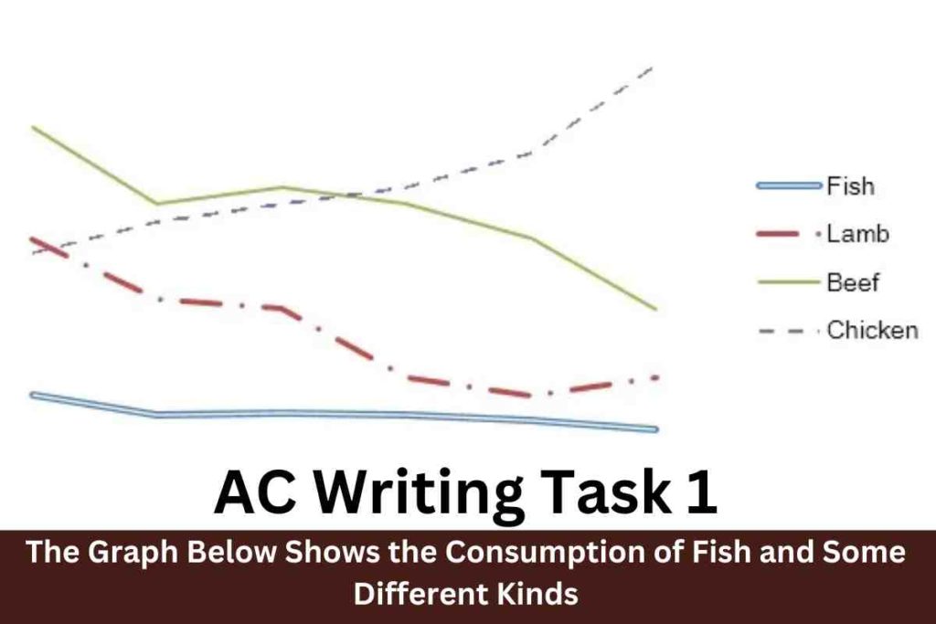
The graph below shows the consumption of fish and some different kinds of meat in a European country between 1979 and 2004. Summarise the information by selecting and reporting the main features, and make comparisons where relevant. Sample 1 :-The Graph Below Shows the Consumption of Fish and Some Different Kinds The line graph exemplifies […]
The Graph Below Shows the Consumption of Fish and Some Different Kinds Read More »