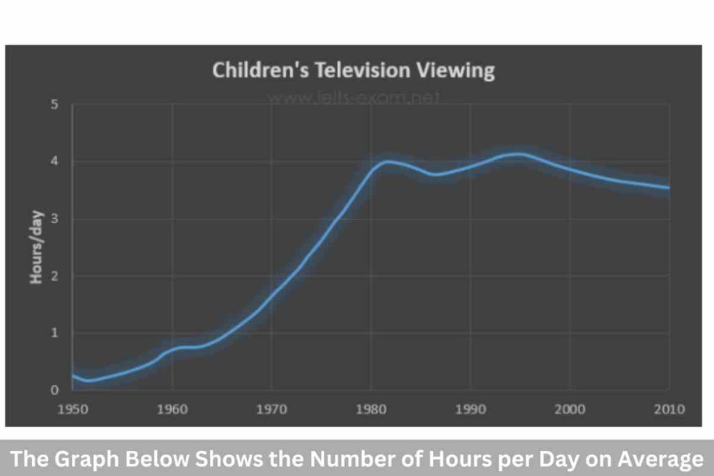
The Table Below Gives Information on Consumer Spending: Recent AC Test
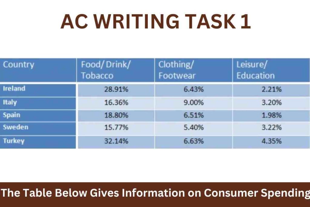
The table below gives information on consumer spending on different items in five different countries in 2002. Summarise the information by selecting and reporting the main features, and make comparisons where relevant. Sample 1:-The Table Below Gives Information on Consumer Spending: Recent AC Test The chart given depicts five European nations’ expenditures on various sources […]
The Table Below Gives Information on Consumer Spending: Recent AC Test Read More »