ACADEMIC WRITING TASK 1

The Diagram Below Shows the Process by Which Bricks Are Manufactured for The Building

The Diagram Below Shows the Process by Which Bricks Are Manufactured for The Building

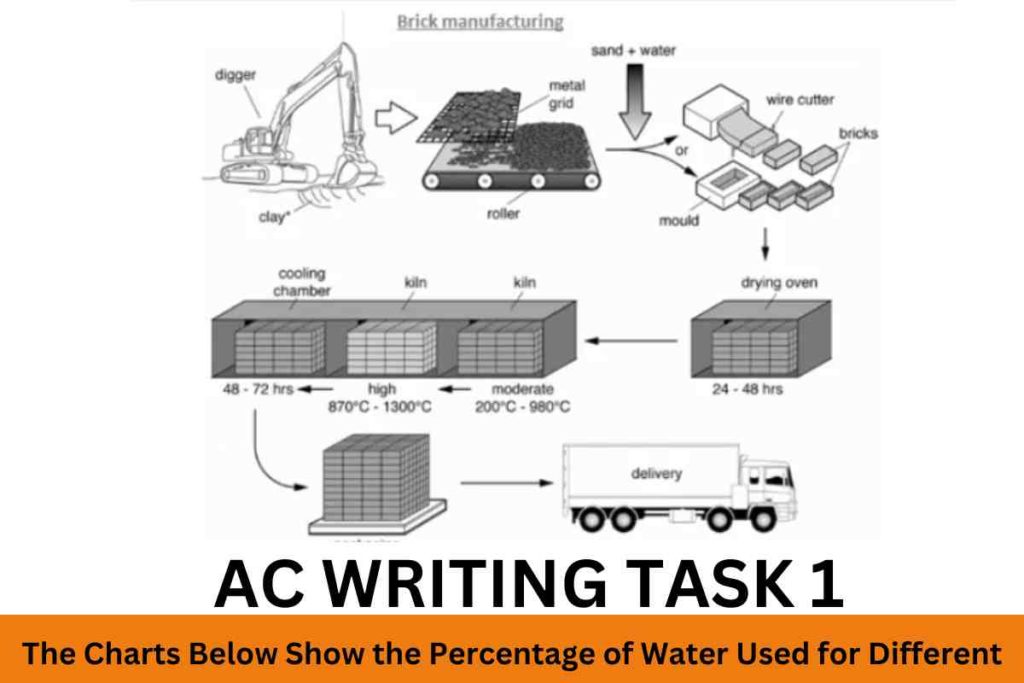
The diagram below shows the process by which bricks are manufactured for the building industry. Summarise the information by selecting and reporting the main features, and make comparisons where relevant. Sample 1:-The Diagram Below Shows the Process by Which Bricks Are Manufactured for The Building The diagram depicts the procedure by which bricks are produced […]

The Diagram Below Shows the Process by Which Bricks Are Manufactured for The Building Read More »

The Diagrams Below Show the Life Cycle of The Silkworm and The Stages

The Diagrams Below Show the Life Cycle of The Silkworm and The Stages

The diagrams below show the life cycle of the silkworm and the stages in the production of silk cloth. Summarise the information by selecting and reporting the main features, and make comparisons where relevant. Sample 1:-The Diagrams Below Show the Life Cycle of The Silkworm and The Stages The diagrams depict the life cycle of

The Diagrams Below Show the Life Cycle of The Silkworm and The Stages Read More »

The Graph Gives Information About the Percentage of The Population of Four

The Graph Gives Information About the Percentage of The Population of Four

The graph gives information about the percentage of the population of four different Asian countries living in cities between 1970 and 2020, with additional predictions for 2030 and 2040. Summarize the information by selecting and reporting the main features and making comparisons where relevant. Sample 1:-The Graph Gives Information About the Percentage of The Population

The Graph Gives Information About the Percentage of The Population of Four Read More »

The Following Map Details a Town Now and A Proposed Future Layout

The Following Map Details a Town Now and A Proposed Future Layout

The following map details a town now and a proposed future layout. Summarise the information by selecting and reporting the main features and make comparisons where relevant. SAMPLE ANSWER 1:-The Following Map Details a Town Now and A Proposed Future Layout The map gives detailed information about the recent plan and proposed plan layout for

The Following Map Details a Town Now and A Proposed Future Layout Read More »

The Given Pie Chart Illustrates how Much Money Was Spent in The Budget

The Given Pie Chart Illustrates how Much Money Was Spent in The Budget

The given pie chart illustrates how much money was spent in the budget on different sectors by the UAE government in 2010. Summarise the information by selecting and reporting the main features and make comparisons where relevant. Sample Answer: The Given Pie Chart Illustrates how Much Money Was Spent in The Budget The par chart

The Given Pie Chart Illustrates how Much Money Was Spent in The Budget Read More »

The Graph Below Shows the Number of Hours per Day

The Graph Below Shows the Number of Hours per Day

The Graph below shows the number of hours per day on average, that children spent watching television.  Summarise the information by selecting and reporting the main features and make comparisons where relevant. Sample Answer:-The Graph Below Shows the Number of Hours per Day The graph illustrates the average number of hours children spent watching television

The Graph Below Shows the Number of Hours per Day Read More »

The Graph Below Shows the Percentage of Azerbaijan’s Export

The Graph Below Shows the Percentage of Azerbaijan’s Export

The graph below shows the percentage of Azerbaijan’s export to four countries from 1990 to 2012. Summarise the information by selecting and reporting the main features and make comparisons where relevant. Sample 1:-The Graph Below Shows the Percentage of Azerbaijan’s Export The chart illustrates the percentages of Azerbaijan’s exports to Japan, the US, China, and

The Graph Below Shows the Percentage of Azerbaijan’s Export Read More »

The Bar Chart Illustrates the Percentage of Businesses in Spain

The Bar Chart Illustrates the Percentage of Businesses in Spain

The bar chart illustrates the percentage of businesses in Spain that had a social media presence from 2012 to 2016. Summarise the information by selecting and reporting the main features and make comparisons where relevant. Sample 1:-The Bar Chart Illustrates the Percentage of Businesses in Spain The bar chart shows data on the percentages of

The Bar Chart Illustrates the Percentage of Businesses in Spain Read More »

The Pie Charts Show the Percentage of Pollutants Entering

The Pie Charts Show the Percentage of Pollutants Entering

 The pie charts show the percentage of pollutants entering a specific part of the ocean in 1997 and 2007. Summarise the information by selecting and reporting the main features, and make comparisons where relevant. Sample 1:-The Pie Charts Show the Percentage of Pollutants Entering The two pie charts compare the proportion of domestic sewage, offshore

The Pie Charts Show the Percentage of Pollutants Entering Read More »

The Table Chart Illustrates the Milk Production in A Year

The Table Chart Illustrates the Milk Production in A Year

The table chart illustrates the milk production in a year in four countries (Armenia, Norway, Italy, and German) in 1980, 2000, and 2020. Summarise the information by selecting and reporting the main features, and make comparisons where relevant. Sample 1:-The Table Chart Illustrates the Milk Production in A Year The table charts compare the production

The Table Chart Illustrates the Milk Production in A Year Read More »

The Graph Below Shows the Number of Hours per Day on Average

The Graph Below Shows the Number of Hours per Day on Average

The graph below shows the number of hours per day on average that children spent watching television between 1950 and 2010. Summarise the information by selecting and reporting the main features, and make comparisons where relevant.   Sample Answer:-The Graph Below Shows the Number of Hours per Day on Average The provided line graph presents the

The Graph Below Shows the Number of Hours per Day on Average Read More »

The Movement of People from Villages to Cities for Work

The Movement of People from Villages to Cities for Work

The movement of people from villages to cities for work can cause serious problems in both places. What are the serious problems associated with this? What measures can be taken to solve these problems? Sample Answer:-The Movement of People from Villages to Cities for Work It is true that individuals are moving from rural to

The Movement of People from Villages to Cities for Work Read More »

Scroll to Top