The Diagrams Below Are Existing and Proposed Floor Plans
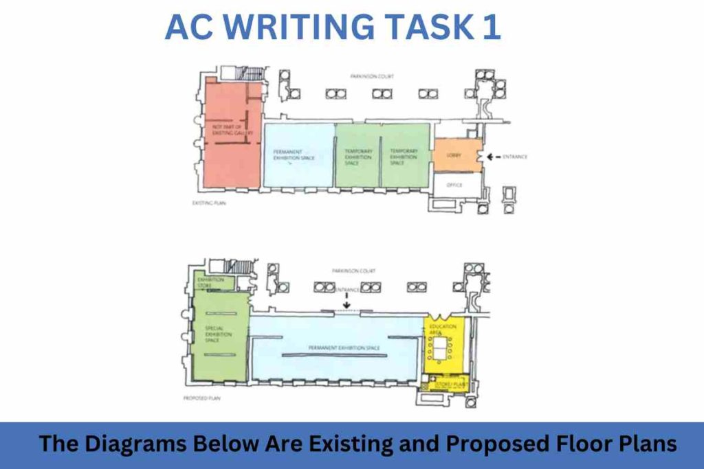
The diagrams below are existing and proposed floor plans for the redevelopment of an art gallery. Summarise the information by selecting and reporting the main features and make comparisons where relevant. Sample 1:-The Diagrams Below Are Existing and Proposed Floor Plans The pictures illustrate the floor plan for the renovation of an art gallery. In […]
The Diagrams Below Are Existing and Proposed Floor Plans Read More »