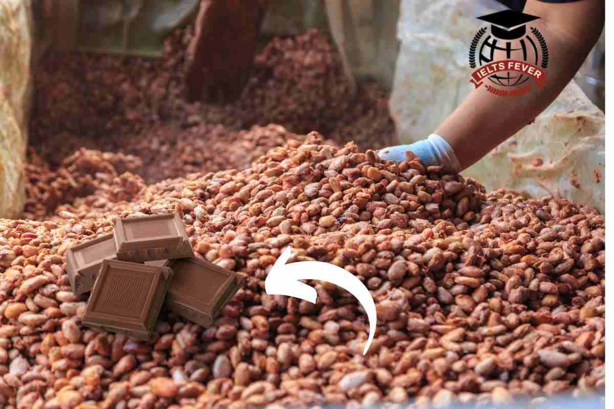
The illustrations show how chocolate is produced. The chart illustrates the manufacturing of chocolates. Overall, it is immediately apparent from the chart that there are a…

The line graph shows the average temperature during the hottest part of the day in Australia in 2007. The chart illustrates the standard inversion of Australia’s…
The table shows the percentage of people with mobile phones who use various features on their phones. The bar chart illustrates the proportion of mobile users…
The graph below shows the information on employment rates across 6 countries in 1995 and 2005. Summarise the information by selecting and report in the main features, and…
The chart below shows the number of men and women in further education in Britain in three periods and whether they were studying full-time or part-time.…