The chart below shows the percentage of young people in higher education in four different countries in 2000, 2005 and 2010. Summarise the information by selecting and reporting the main features and making comparisons where relevant.
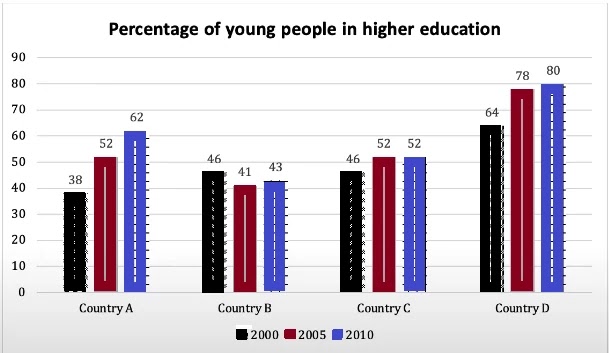
The yielded bar charts demonstrate how many percentages of learners in higher education in four countries, namely country A, country B, country C, and country D, in 2000, 2005 and 2010.
Overall, it can be clearly seen that the number of pupils rose year by year except for country B. In addition, throughout the period, the majority of education percentage was in country D.
For country A, had 38% of students who are studying in higher education, it rose continually and after a decade percentage was 62% which was a quarter proportion more than in 2000. For country, D had the highest percentage in 2000 on account of 64%, which rose and in 2005 it was 78%. After a half decades, it touched its zenith, the four-fifth proportion of learners was in higher studies.
For countries B and C, in 2000, the percentage of young students was the same, 46%. Former one percentage declined and remained 43% in 2012 although, between that time it touched a dip it was 41%. Later one grew slightly and had the same percentage later moreover, and it was same as country A had in 2005.
Follow Us on IELTSFever Instagram for more updates and the latest test tasks.
Also, Read The Chart Shows Days Taken Off Work Due to Stress-related illnesses.
Discover more from IELTS Fever
Subscribe to get the latest posts sent to your email.