The chart compares the number of people per household by percentage in the UK in 1981 and 2001.
Summarise the information by selecting and reporting the main features and make comparisons where relevant.
Sample Answer of The Chart Compares the Number of People Per Household by Percentage in the UK
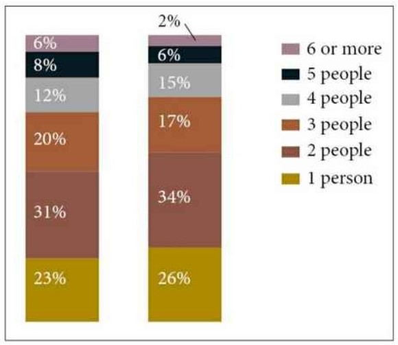
The bar chart illustrates data about how many people live per household in six various categories in Britain, between 1981 and 2001, information is given in percentage.
Overall, the proportion of 2 individuals was greater than other categories, whereas 6 and more than 6 had the least rates in both years.
With regard to 1981, the percentage of single-person and 3 individual people was almost the same, about one-fifth. however, 1 person proportion was almost double to 4 people who live in a family. 5 and 6 or more than that members in families these two categories had the least proportion in the same year, just more than 5%. The most common household per person was 2 people in a family, which is accounted for 31%.
In 2010, the percentage of 4 people and the single person had increased by 3%, while 5 and 3 family members in a family, these categories decreased by around 2%. The ratio of 2 people had the same trend as well as increased from 31% to 34%. Only 2% of households had 6 or more than 6 people in the family.
Also, Read
Describe a Place/person/home You Like to Visit but Don’t Want to Live There.
Discover more from IELTS Fever
Subscribe to get the latest posts sent to your email.