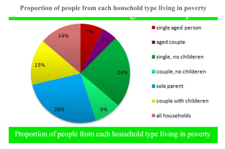
The pie chart below shows the proportion of different categories of families living in poverty in the UK in 2002. The proportion of people from each household type living in poverty. Summarise the information by selecting and reporting the main features, and make comparisons where relevant. Write at least 150 words.
Sample Answer of The Pie Chart Below Shows the Proportion of Different Categories of Families Living in Poverty in the Uk in 2002.
The pie chart examines the different type of families who were living in poor conditions in the UK in the year 2002.
As an overall trend, 14% of the entire households in the UK at that time were in conditions of poverty. In general, single people struggled more than couples.
In particular, as far as people with children are concerned, sole parents showed the highest percentage of 26% among all the given categories while couples with children accounted for a relatively smaller percentage of 15%.
When it comes to people with no children, single people made up a large percentage of 24%, which is almost the same figure for single people with children. On the other hand, only 9% of the couples without any children suffered from poverty in 2002. In terms of aged people, singles had a slightly higher percentage than couples. Only 7% and 5% of the aged population had hardships in their living circumstances.
Discover more from IELTS Fever
Subscribe to get the latest posts sent to your email.