The chart shows the employment status of adults in the US in 2003 and 2013. Summarise the information by selecting and reporting the main features, and make comparisons where relevant.
 Sample Answer of The Chart Shows the Employment Status of Adults in the US
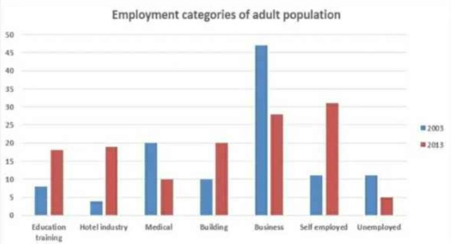
The provided bar charts reveal the united states of America’s adolescent’s employment status in 2003 and 2013; employment status was divided into six different categories.
Overall, we can clearly see American adults dominant in employment categories year by year except for business, medical, and unemployed. In 2003 the highest number of employees was in the business field which places taken by self-employed in 2013.
For 2003, self-employed and unemployed and building categories had the same proportion of adult employees on account of a tenth. With the highest percentage business was top on the list with 46%. However, least was the hotel industry, below 5%. Education training had 7% adult population while medical had one in fifth.
After a decade, the percentage of adults was double in the building field while half on the medical side. With 5% unemployed was declined, the major population was on self-employed with three in tenth. Business categories adults population go down 18%. Education training and hotel industry employment jumped up and remained the same percentage as medical had in 2003.
Discover more from IELTS Fever
Subscribe to get the latest posts sent to your email.