Sample Answer:The charts below show the growth in the population in some of the world’s largest cities
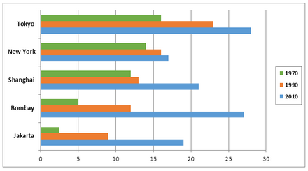
The diagram illustrates information about the growth and distribution of the number of people in towns and countryside in the largest cities in the world in 1970, 1990, and 2010.
Overall, population growth and distribution rose inconsiderably, ascending the chart in four given cities in 1970, followed by a dramatically elevated level in 1990. However, in 2010, both towns showed fluctuating populations.
In 1970, Jakarta appeared to be an insignificantly less populated city with fewer than five inhabitants, while Bombay had precisely 5. Furthermore, Shanghai and New York both had relatively similar populations, approximately less than 15.
In 1990, Jakarta was again at the lowest level in terms of population, with less than 10. However, Bombay and Shanghai had approximately the same population, below 15. On the other hand, New York had a population of more than 15, behind Tokyo, which had a massive population of more than 20.
Also, Read The Chart Below Shows the Numbers of Incidents and Injuries per 100 Million Passenger Miles Traveled
In 2010, Jakarta and New York shared a population of around 19. Shanghai had more than 20 people. Nevertheless, Bombay and Tokyo were the most populated cities, with around 30.
Discover more from IELTS Fever
Subscribe to get the latest posts sent to your email.