The charts below show the percentage of their food budget the average family spent on restaurant meals in different years. The graph shows the number of meals eaten in fast-food restaurants and sit-down restaurants. Give reasons for your answer and include any relevant examples from your own knowledge or experience.
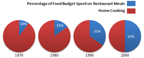
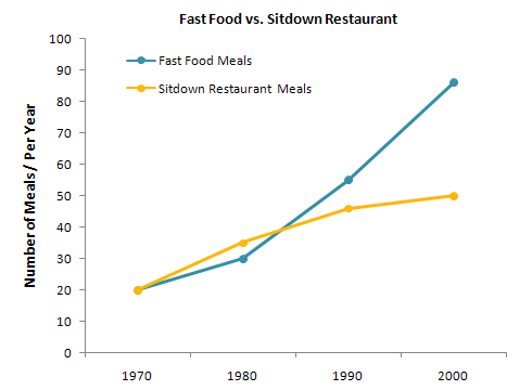
The pie charts illustrate the information about the proportion of money spent on a restaurant meal and home food. The line graph depicts the number of meals eaten in two different category restaurants.
Overall, it can be seen that proportion of home cooking decreased over time, while spending on the meal in the restaurant increased. Also, The number of meals rose with times in both restaurants.
It is interesting to note that 90% budget was spent on home cooking and 10% on a restaurant meal. By contrast, these figures gradually increased for a restaurant meal and were declined for home food, which was accounted for half of the budget each in 2000.
Moving towards to the line graph it can immediately be seen that 20 Meals per year were eaten in both restaurants. In contrast, till 1980 sitdown restaurant meals higher than fast-food meals after that fast food meals count drastically rose and reached 90 meals in 2000. 50 Meals were accounted in Sitdown restaurant in 2000.
Follow Us on IELTSFever Twitter for more updates and the latest news.
Also Read The Bar Chart Below Shows the Average Duration of Housework Women Did
Discover more from IELTS Fever
Subscribe to get the latest posts sent to your email.