The charts below show the results of a survey of adult education. The first chart shows the reasons why adults decide to study. The pie chart shows how people think the costs of adult education should be shared. Write a report for a university lecturer describing the information shown below.
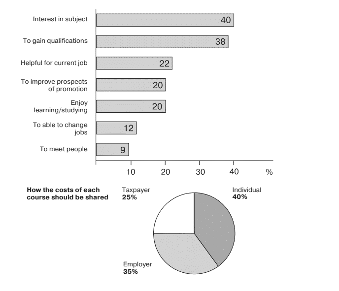
The graphs provide information about the outcome derived from the research of adult education. The bar chart draws the intention behind the study decision of mature. In contrast, the pie chart describes the mentality of individuals regarding the costs of adult education that how it should be proportioned.
Overall, it is evident that individuals pay the highest part of the value, and they do so for their own attentiveness about subjects as well as to obtain eligibility.
While inspecting the bar graph, it can be noticed that 40% of the students choose to study further owing to interest in the subject, which is the major cause. The aim of gaining qualifications is 2% less than the above reason stated. Mature enjoy studying at the same level as they want to improve their chance to get a promotion, at 20%. 9% of adults select to gain knowledge as to meet various folks.
Deciding on the expenditure of courses, people believe that only a quarter proportion of the cost should be borne by the taxpayer and major ( that is 40%) cost, an individual should arrange. As employers get the most benefit from adult education, they should pay 35% of the total value.
Follow Us on IELTSFever Instagram for more updates and the latest test tasks.
Also, Read The Chart Below Shows the Global Sales
Discover more from IELTS Fever
Subscribe to get the latest posts sent to your email.