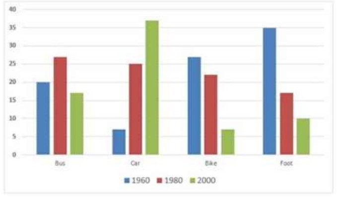
The following bar chart shows the different modes of transport used to travel to and from work in one European city in 1960, 1980 and 2000.
Summarise the information by selecting and reporting the main features and make comparisons where relevant.
Sample Answer of The Following Bar Chart Shows the Different Modes of Transport
The bar chart depicts the diverse type of transportation utilizes for commuting from the workplace in Europe in three decades.
Most of the people use pedestrians in 1960, which was only 2 percent less who were using car in 2000. After two-decade, almost half the people who were using feet for travel started using other modes. In 2000 there were only 10 percent people who were walker. Whereas, In 1980 there were exactly 25 percent individuals who were using their car. Which was only 7 before two decades.
Furthermore, Fluctuation has been noticed in the use of busses which was inclined in 1980, and it again decreased by 10 percent in 2000. On the other hand, Most people prefer to use their two-wheeler in 1960, which decreased up to 5 percent within twenty years. A sudden fall has been noticed in the ratio who operated bikes that were equal to the ratio using the car in 1960.
Overall, the usage of bikes was observed has been to fall with time. Whereas, preference for cars was increased by the time. On the other hand, people who travel by bus have almost remained the same even after forty years.
Discover more from IELTS Fever
Subscribe to get the latest posts sent to your email.