The graph above shows information about employment rates across 6 countries in 1995 and 2005. Summarize the information by choosing and describing the main idea, and make comparisons where appropriate.
 Sample Answer The Graph Above Shows Information About Employment Rates Across 6 Countries in 1995 and 2005
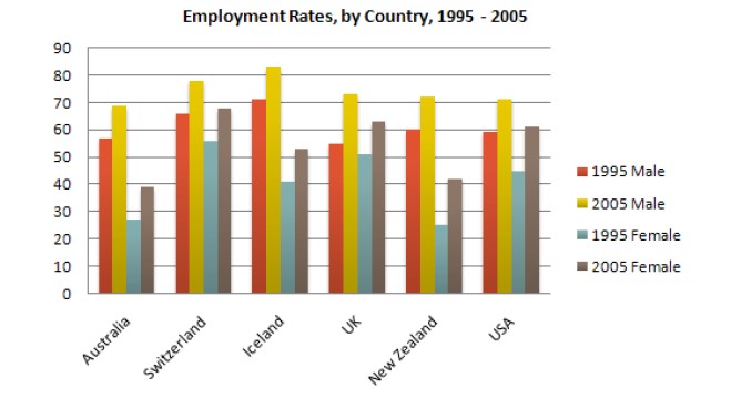
The bar chart provides the employment rates of different genders in 6 countries between 1995 and 2005.
Overall, it shows that the males had a better job record than the females. Furthermore, during a decade the work opportunity for both males and females increased all over the countries. It is evident that the man employment conditions in Iceland were comparatively higher than the other four countries, reaching 70 to 80 percent in ten years.
As given in the diagram, in 1995, more than 60% of men were employed in Switzerland and Iceland, while in the other four countries the rates were equal to or below 60%. After ten years, the male employment percentage was over 70%, except for Australia. In contrast, by 1995, the female employment rate was more than 50% for Switzerland only. Meanwhile, the rest of the countries were around 20 % to 50%. This data rose ten years later so that in 2005, the female employment rate reached nearly 70% in Switzerland and for the rest of the countries, it was under 65%.
Follow Us on IELTSFever Twitter for more updates
Discover more from IELTS Fever
Subscribe to get the latest posts sent to your email.