The graph below gives information about changes in the birth and death rates in New Zealand between 1901 and 2101. Summarise the information by selecting and reporting the main features, and make comparisons where relevant.
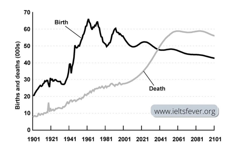
The graph shows details about changes in the birth and death rates in New Zealand almost 200 years. The horizontal axis denotes years, and the vertical axis represents the number of birth and death in thousands. Overall, point of view in graph death rates are steadily increased after the year 200 and birth rates going to downward and fluctuating since from 2021.
In 1901, birth rates were 20000, which is almost 10000 higher than death rates. Every 20 years analysis, birth rates are gradually run high and reached peak figure of around 65000 in the year 1961. The death rates rose slowly and arrived at 20,000 the same year. The major figure reported at the year 1981 birth rates comes down 50,000 compare four decades (1961 -2001)
The graph indicates, the year 2020 birth rate is about 50,000, and the death rate is approximately 30,000. The lines are crossing the year 2041, and figures are the same, around 49000. Thereafter, death rates a fast-growing swing near 59000 for the years between 2061 to 2081 then slice declining in 2101. The birth rates to future next six decades reaching almost 49000 in the year 2101.
Follow Us on IELTSFever Twitter for more updates
Also read: The Graph Below Shows how Elderly People in The United States
Discover more from IELTS Fever
Subscribe to get the latest posts sent to your email.