The graph below shows the different modes of transport used to travel to and from work in one European city in 1960, 1980 and 2000. Write a report for a university lecturer describing the information below.
The graph below shows the different modes of transport used to travel to and from work in one European city in 1960, 1980 and 2000. Write a report for a university lecturer describing the information below.
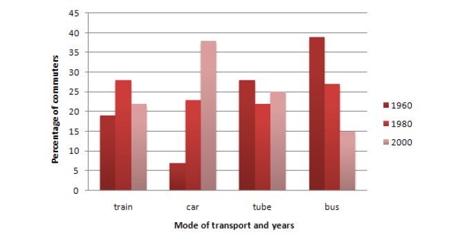
The given bar demonstrates four different transportation which was used for travel and work in 1960, 1980 and in 2000 in a European city. Overall, it can be seen that car and bus usage over the period of time is an opposite trend with each other while train and tube were with each other too.
For car, in 1960, only 6% of people were using this mode of transportation which percentage grew to 23% and the peak of 36% in 1980 and 2000 respectively. For bus, the highest percentage of commuters used this transportation in 1960, on account of over 37%. However, in 1980, it dropped from 38% to just a quarter and there to 15% in 2000.
For tube, 18% of commuters had used this mode of transportation in 1960, and after two decades, it had same proportion as the car had in 1980. In 2000 the percentage of passengers was precisely 25%. For train, there were 16% of people in 1960, and after four decades, it was 22% after peak up in 1960 to the same proportion as the tube had in 1960.
Follow Us on IELTSFever Twitter for more updates
Discover more from IELTS Fever
Subscribe to get the latest posts sent to your email.