ACADEMIC WRITING TASK 1

The Charts Below Show the Number of Japanese Tourists Travelling Abroad Between 1985 and 1995 and Australia’s Share of The Japanese Tourist Market

The Charts Below Show the Number of Japanese Tourists Travelling Abroad Between 1985 and 1995 and Australia’s Share of The Japanese Tourist Market (1)

The charts below show the number of Japanese tourists travelling abroad between 1985 and 1995 and Australia’s share of the Japanese tourist market. Write a report for a university lecturer describing the information shown below. The bar graph and line graph show the number of Japanese tourists travelling abroad between 1985 to 1995 and Australia’s […]

The Charts Below Show the Number of Japanese Tourists Travelling Abroad Between 1985 and 1995 and Australia’s Share of The Japanese Tourist Market Read More »

The Pie Charts Below Give Data on The Spending and Consumption of Resources by Countries of The World and How the Population Is Distributed

The Pie Charts Below Give Data on The Spending and Consumption of Resources by Countries of The World and How the Population Is Distributed (1)

The pie charts below give data on the spending and consumption of resources by countries of the world and how the population is distributed. Write a report for a university lecturer describing the information shown below. Sample Answer of The Pie Charts Below Give Data on The Spending and Consumption of Resources by Countries of

The Pie Charts Below Give Data on The Spending and Consumption of Resources by Countries of The World and How the Population Is Distributed Read More »

The Diagram Below Shows the Life Cycle of A Salmon, from Egg to Adult Fish

The Diagram Below Shows the Life Cycle of A Salmon, from Egg to Adult Fish (2) (1)

The diagram below shows the life cycle of a salmon, from egg to adult fish. Summarise the information by selecting and reporting the main features and making comparisons where relevant. Sample Answer of The diagram below shows the life cycle of a salmon, from egg to adult fish The process diagram illustrates the life cycle

The Diagram Below Shows the Life Cycle of A Salmon, from Egg to Adult Fish Read More »

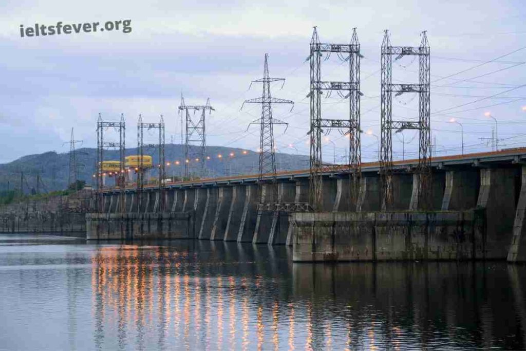
The Diagram Below Shows how Electricity Is Generated in A Hydroelectric Power Station

The Diagram Below Shows how Electricity Is Generated in A Hydroelectric Power Station (1)

The diagram below shows how electricity is generated in a hydroelectric power station. Summarise the information by selecting and reporting the main features, and make comparisons where relevant. Summarize the information by selecting and reporting the main features, and make comparisons where relevant. Sample Answer of The Diagram Below Shows how Electricity Is Generated in

The Diagram Below Shows how Electricity Is Generated in A Hydroelectric Power Station Read More »

The Chart Below Shows Information About Heart Attacks by Ages and Genders in The USA

The Chart Below Shows Information About Heart Attacks by Ages and Genders in The USA (1)

The chart below shows information about Heart Attacks by Ages and Genders in the USA. Summarise the information by selecting and reporting the main features, and make comparisons where relevant. Sample Answer of The Chart Below Shows Information About Heart Attacks by Ages and Genders in The USA The bar chart illustrates the number of

The Chart Below Shows Information About Heart Attacks by Ages and Genders in The USA Read More »

The Table Below Shows the Number of Visitors in The Uk and Their Average Spending from 2003 to 2008

The table below shows the number of visitors in the UK and their average spending from 2003 to 2008

The table below shows the number of visitors in the UK and their average spending from 2003 to 2008. Summarize the information by selecting and deporting the main features and making compassion where relevant. Sample Answer of The Table Below Shows the Number of Visitors in The Uk and Their Average Spending from 2003 to

The Table Below Shows the Number of Visitors in The Uk and Their Average Spending from 2003 to 2008 Read More »

The Graph Below Shows the Top Priorities by Business Companies in The Usa in 2016

The Graph Below Shows the Top Priorities by Business Companies in The Usa in 2016 (1)

The graph below shows the top priorities by business companies in the USA in 2016. Summarise the information by selecting and reporting the main features and making comparisons where relevant. The bar graph displays the priorities established by firms in the United States in 2016 based on their sizes. Overall, It is obvious that small

The Graph Below Shows the Top Priorities by Business Companies in The Usa in 2016 Read More »

The Diagram Below Shows the Process by Which Bricks Are Manufactured for the Building Industry

The Diagram Below Shows the Process by Which Bricks Are Manufactured for the Building Industry (1)

The diagram below shows the process by which bricks are manufactured for the building industry. Summarise the information by selecting and reporting the main features, and make comparisons where relevant. Sample Answer of The Diagram Below Shows the Process by Which Bricks Are Manufactured for the Building Industry The diagram delineates data regarding how bricks

The Diagram Below Shows the Process by Which Bricks Are Manufactured for the Building Industry Read More »

The Chart Below Shows the Average Daily Minimum and Maximum Levels of Two Air Pollutants in Four Big Cities in 2000

The Chart Below Shows the Average Daily Minimum and Maximum Levels of Two Air Pollutants in Four Big Cities in 2000 (1)

The chart below shows the average daily minimum and maximum levels of two air pollutants in four big cities in 2000. Summarise the information by selecting and reporting the main features and making comparisons where relevant. Sample Answer of The Chart Below Shows the Average Daily Minimum and Maximum Levels of Two Air Pollutants in

The Chart Below Shows the Average Daily Minimum and Maximum Levels of Two Air Pollutants in Four Big Cities in 2000 Read More »

The Flowchart Below Shows the Process Involved in Completing the Work Experience Requirement for University Students

The Flowchart Below Shows the Process Involved in Completing the Work Experience Requirement for University Students (1)

The flowchart below shows the process involved in completing the work experience requirement for university students. Summarise the information by selecting and reporting the main features, and make comparisons where relevant. The flow chart describes the steps used for filling job experience for graduates seeking work. Overall, there are six basic steps to follow, starting

The Flowchart Below Shows the Process Involved in Completing the Work Experience Requirement for University Students Read More »

The Graph Shows the Percentage of Male and Female Academic Staff Members Across the Faculties of A Major University in 2016

The Graph Shows the Percentage of Male and Female Academic Staff Members Across the Faculties of A Major University in 2016 (1)

The graph shows the percentage of male and female academic staff members across the faculties of a major university in 2016. Summarise the information by selecting and reporting the main feature, and make comparisons where relevant. The graph illustrates the ratio of male to female teachers in a particular higher institution in various departments, namely

The Graph Shows the Percentage of Male and Female Academic Staff Members Across the Faculties of A Major University in 2016 Read More »

The Graph Compares the Percentage of International and The Percentage of Uk Students Gaining Second Class Degrees or Better at A Major Uk University in 2009

The Graph Compares the Percentage of International and The Gaining Second Class Degrees or Better at A Major Uk University in 2009 (1)

The graph compares the percentage of international and the percentage of UK students gaining second class degrees or better at a major UK University in 2009. Summarise the information by selecting and reporting the main features, and make comparisons where relevant. Sample Answer The Graph Compares the Percentage of International and The Percentage of Uk

The Graph Compares the Percentage of International and The Percentage of Uk Students Gaining Second Class Degrees or Better at A Major Uk University in 2009 Read More »

Scroll to Top