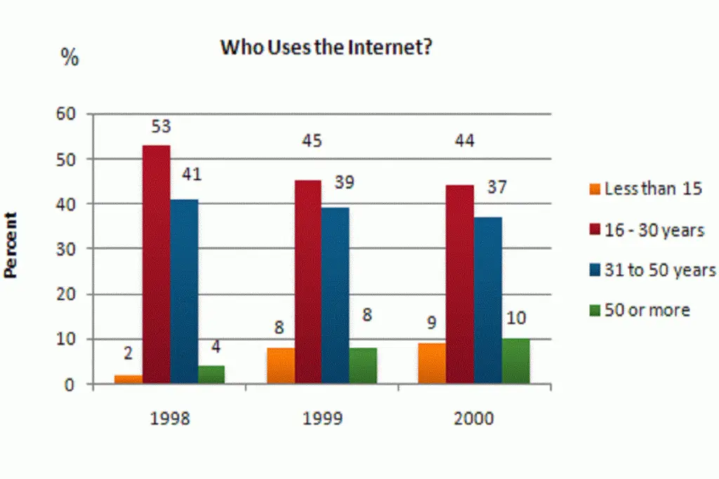
ACADEMIC WRITING TASK 1

The diagram below shows how the Australian Bureau of Meteorology

how the Australian Bureau of Meteorology collects up-to-the-minute information on the weather in order to produce reliable forecasts.

The diagram below shows how the Australian Bureau of Meteorology collects up-to-the-minute information on the weather in order to produce reliable forecasts.   Summarize the information by selecting and reporting the main features and make comparisons where relevant. You should write at least 150 words. sample answer Of(The diagram below shows how the Australian Bureau of […]

The diagram below shows how the Australian Bureau of Meteorology Read More »

Brandfield City planners have decided to build a new shopping mall

Brandfield City planners have decided to build a new shopping mall

Brandfield City planners have decided to build a new shopping mall for the area, and two sites, S1 and S2 have been proposed Summarize the information by selecting and reporting the main features and make comparisons where relevant. You should write at least 150 words. sample answer: INTRODUCTION: The graph gives the information regarding the city

Brandfield City planners have decided to build a new shopping mall Read More »

The charts below show the main reasons for study among students

The charts below show the main reasons for study among students of different age groups and the amount of support they received from employers

The charts below show the main reasons for study among students of different age groups and the amount of support they received from employers. Summarize the information by selecting and reporting the main features and make comparisons where relevant. INTRODUCTION: The two bar charts give information about the main reasons for study according to the

The charts below show the main reasons for study among students Read More »

The table gives statistics showing the aspects of quality of life

The table gives statistics showing the aspects of quality of life in five countries.

The table gives statistics showing the aspects of quality of life in five countries. Summarize the information by selecting and reporting the main features and make comparisons where relevant. You should write at least 150 words. sample answer :   The table illustrates the information regarding the statistics of five countries in order to demonstrate the

The table gives statistics showing the aspects of quality of life Read More »

The table gives statistics showing the aspects of quality of life

The table gives statistics showing the aspects of quality of life in five countries.

The table gives statistics showing the aspects of quality of life in five countries. Summarize the information by selecting and reporting the main features and make comparisons where relevant. You should spend about 20 minutes on this task. . You should write at least 150 words. SAMPLE ANSWER: The diagram demonstrates the process that can be

The table gives statistics showing the aspects of quality of life Read More »

The Ratio of students Attending Four Secondary School Types Between

The Ratio of students Attending Four Secondary School Types Between 2000 and 2009.

The Ratio of students Attending Four Secondary School Types Between 2000 and 2009. Summarize the information by selecting and reporting the main features and make comparisons where relevant. You should write at least 150 words. SAMPLE ANSWER: The given graph elucidates the percentage of pupils of 2000, 2005 and 2009 attending four different secondary schools. In

The Ratio of students Attending Four Secondary School Types Between Read More »

The three pie charts below show the changes in annual spending by a particular UK school

The three pie charts below show the changes in annual spending by a particular UK school in 1981, 1991 and 2001. The given three pie charts compare the expenditures of an academy of the United Kingdom in the given time period 1981, 991, and 2001. To begin, in the year 1981, the teachers’ salaries were

The three pie charts below show the changes in annual spending by a particular UK school Read More »

The flow chart below the recycling procedure of glass bottles. Summarize the information by selecting and reporting the main feature, and make comparisons where relevant..

The flow chart below the recycling procedure of glass bottles. Summarize the information by selecting and reporting the main feature, and make comparisons where relevant. The process chart depicts the recycling progress of glass bottles in different stages which are given in the chart. the first step of recycling where glass bottles collected by public

The flow chart below the recycling procedure of glass bottles. Summarize the information by selecting and reporting the main feature, and make comparisons where relevant.. Read More »

The diagrams below show the stages and equipment used in the cement-making process, and how cement is used to produce concrete for building purposes.

The diagrams below show the stages and equipment used in the cement-making process, and how cement is used to produce concrete for building purposes. Sample answer 1:- The given both process charts illustrate the steps and material which are used to make cement and how is concrete is produced for the construction of the building.

The diagrams below show the stages and equipment used in the cement-making process, and how cement is used to produce concrete for building purposes. Read More »

The graph shows internet usage in Taiwan by age group, 1998-2000.

The graph shows internet usage in Taiwan by age group, 1998-2000.   The given vertical bar graph depicts the information about the proportion of using the internet in Taiwan by four different age group in the given years 1998 to2000. To elaborate, the highest percentage of the custom of the internet was at 53%, 45%

The graph shows internet usage in Taiwan by age group, 1998-2000. Read More »

The Table Below Describes Percentages of Home Schooled Students in Some Country

The Table Below Describes Percentages of Home Schooled Students in Some Country

The table below describes percentages of home-schooled students in SomeCountry in 1999-2004. Write a report for a university lecturer describing the information shown. This table shows homeschooled students in some countries in the years 1999-2004 in percentages. The main trend is that all grades including kindergarten are growing every year. Kindergarten started highest at 2.4

The Table Below Describes Percentages of Home Schooled Students in Some Country Read More »

Compares the Number of Visits to Two New Music Sites on The Web.

Compares the Number of Visits to Two New Music Sites on The Web

The graph below compares the number of visits to two new music sites on the web. Write a report for a university lecturer describing the information shown below The graph shows people using new music places on the Internet in fifteen days namely personal choice and trendy pop music. The overall trend shows fluctuation with a

Compares the Number of Visits to Two New Music Sites on The Web. Read More »

Scroll to Top