ACADEMIC WRITING TASK 1

The Chart Below Shows Waste Collection by A Recycling Center from 2011 to 2015: AC Writing

The Chart Below Shows Waste Collection by A Recycling Center from 2011 to 2015

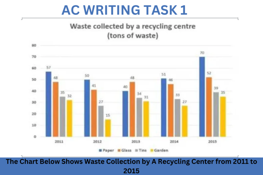
The chart below shows waste collection by a recycling center from 2011 to 2015. Summarise the information by selecting and reporting the main features and make comparisons where relevant. Sample 1:-The Chart Below Shows Waste Collection by A Recycling Center from 2011 to 2015 The Chart illustrates information about the waste collection of paper, glass, […]

The Chart Below Shows Waste Collection by A Recycling Center from 2011 to 2015: AC Writing Read More »

The Table Below Shows the Proportion of Different Categories of Families

The Table Below Shows the Proportion of Different Categories of Families

The table below shows the proportion of different categories of families living in poverty in Australia in 1999. Summarise the information by selecting and reporting the main features and make comparisons where relevant. SAMPLE ANSWER 1:-The Table Below Shows the Proportion of Different Categories of Families As from the upper table information, prevailing a view

The Table Below Shows the Proportion of Different Categories of Families Read More »

The Diagram Below Shows how The Australian Bureau of Meteorology

The Diagram Below Shows how The Australian Bureau of Meteorology

The diagram below shows how the Australian Bureau of Meteorology collects up-to-the-minute weather information to produce reliable forecasts. Summarise the information by selecting and reporting the main features and make comparisons where relevant. SAMPLE ANSWER 1:-The Diagram Below Shows how The Australian Bureau of Meteorology As from the upper diagram represtation, providing us a clear

The Diagram Below Shows how The Australian Bureau of Meteorology Read More »

The Table Below Gives Information About the Underground Railway Systems in Six Cities

The Table Below Gives Information About the Underground Railway Systems in Six Cities

The table below gives information about the underground railway systems in six cities. Summarise the information by selecting and reporting the main features and make comparisons where relevant. Sample 1:-The Table Below Gives Information About the Underground Railway Systems in Six Cities The given data illustrates the information of opening date, the number of passengers

The Table Below Gives Information About the Underground Railway Systems in Six Cities Read More »

The Diagrams Below Are Existing and Proposed Floor Plans

The Diagrams Below Are Existing and Proposed Floor Plans

The diagrams below are existing and proposed floor plans for the redevelopment of an art gallery. Summarise the information by selecting and reporting the main features and make comparisons where relevant. Sample 1:-The Diagrams Below Are Existing and Proposed Floor Plans The pictures illustrate the floor plan for the renovation of an art gallery. In

The Diagrams Below Are Existing and Proposed Floor Plans Read More »

The Diagrams Below Show Some House Design Principles for Cool and Warm Climates

The Diagrams Below Show Some House Design Principles for Cool and Warm Climates

The diagrams below show some house design principles for cool and warm climates. Summarise the information by selecting and reporting the main features and make comparisons where relevant. Sample 1:-The Diagrams Below Show Some House Design Principles for Cool and Warm Climates The diagrams display how houses are designed for different climates. Overall, it can be seen that

The Diagrams Below Show Some House Design Principles for Cool and Warm Climates Read More »

Percentages of Mobile Phone Owners Using Various Mobile Phone

Percentages of Mobile Phone Owners Using Various Mobile Phone

Percentages of mobile phone owners using various mobile phone features. Summarise the information by selecting and reporting the main features and make comparisons where relevant. Sample 1:-Percentages of Mobile Phone Owners Using Various Mobile Phone The table illustrates the percentages of mobile phone holders using seven different mobile phone components from 2006 to 2010. Overall,

Percentages of Mobile Phone Owners Using Various Mobile Phone Read More »

The Diagram Below Shows the Typical Stages of Consumer

The Diagram Below Shows the Typical Stages of Consumer

The diagram below shows the typical stages of consumer goods manufacturing, including the process by which information is fed back to earlier stages to enable adjustment. Write a report for a university lecturer describing the process shown. Sample 1:-The Diagram Below Shows the Typical Stages of Consumer The depicted figure reveals a pattern of product

The Diagram Below Shows the Typical Stages of Consumer Read More »

The Plans Below Show how The Ground Floor of A Particular Building

The Plans Below Show how The Ground Floor of A Particular Building

The Plans below show how the ground floor of a particular building has changed over time. Summarise the information by selecting and reporting the main features and make comparisons where relevant. Sample 1:-The Plans Below Show how The Ground Floor of A Particular Building The diagram illustrates the proposals for a ground floor of a

The Plans Below Show how The Ground Floor of A Particular Building Read More »

The Chart Below Shows the Amount of Leisure Time Enjoyed: AC Writing

The Chart Below Shows the Amount of Leisure Time Enjoyed

The chart below shows the amount of leisure time enjoyed by men and women of different employment statuses. Write a report for a university lecturer describing the information below. Sample 1:-The Chart Above Shows the Amount of Leisure Time Enjoyed The given bar chart illustrates information about how many weekly hours were spent by four

The Chart Below Shows the Amount of Leisure Time Enjoyed: AC Writing Read More »

The Pie Charts Below Show the Online Sales for Retail Sectors in New Zealand

The Pie Charts Below Show the Online Sales for Retail Sectors in New Zealand

The pie charts below show the online sales for retail sectors in New Zealand in 2003 and 2013. Summarise the information by selecting and reporting the main features, and make comparisons where relevant. Sample 1: The Pie Charts Below Show the Online Sales for Retail Sectors in New Zealand The pie chart illustrates web sales

The Pie Charts Below Show the Online Sales for Retail Sectors in New Zealand Read More »

The Chart Below Shows The Price In Euros Of 800 Grams Of Four Types Of Bread

The Chart Below Shows The Price In Euros Of 800 Grams Of Four Types Of Bread

The chart below shows the price in euros of 800 grams of four types of bread in one European country from 2001 to 2006. Summarize the information by selecting and reporting the main features, and make comparisons where relevant. Sample 1 The chart below shows the price in euros of 800 grams of four types

The Chart Below Shows The Price In Euros Of 800 Grams Of Four Types Of Bread Read More »

Scroll to Top