ACADEMIC WRITING TASK 1

The Chart Below Shows Estimated World Literacy Rates by Region and By Gender for The Year 2000: AC Writing

The Chart Below Shows Estimated World Literacy Rates by Region and By Gender for The Year 2000 AC Writing

The chart below shows estimated world literacy rates by region and by gender for the year 2000. Write a report for a university lecturer describing the information below. Overall, the literacy rate in developed countries was minimum, whereas it was highest in south Asia. The gender-wise literacy rate was more in females than in males. In […]

The Chart Below Shows Estimated World Literacy Rates by Region and By Gender for The Year 2000: AC Writing Read More »

The Chart Shows the Employment Status of Adults in The Us in 2003 and 2013: AC Writing Task 1

The Chart Shows the Employment Status of Adults in The Us in 2003 and 2013 AC Writing Task 1

The chart shows the employment status of adults in the US in 2003 and 2013. Summarise the information by selecting and reporting the main features, and make comparisons where relevant. The chart shows the employment status of adults in the US in 2003 and 2013. Summarise the information by selecting and reporting the main features,

The Chart Shows the Employment Status of Adults in The Us in 2003 and 2013: AC Writing Task 1 Read More »

The Table and Charts Below Give Information on The Police Budget for 2017 and 2018 in One Area of Britain

The Table and Charts Below Give Information on The Police Budget for 2017 and 2018 in One Area of Britain

The table and charts below give information on the police budget for 2017 and 2018 in one area of Britain. The table shows where the money came from, and the charts show how it was distributed. Summarise the information by selecting and reporting the main features, and making relevant comparisons. The table and charts depict

The Table and Charts Below Give Information on The Police Budget for 2017 and 2018 in One Area of Britain Read More »

The Chart Shows British Emigration to Selected Destinations Between 2004 and 2007

The Chart Shows British Emigration to Selected Destinations Between 2004 and 2007 (1)

The chart shows British Emigration to selected destinations between 2004 and 2007. Summarize the information by selecting and reporting the main features and make comparisons where relevant. The chart represents British Emigration to Australia, Spain, New Zealand, USA and France from 2004 to 2007. Overall, the most favourite location for emigration remained Australia each year, while

The Chart Shows British Emigration to Selected Destinations Between 2004 and 2007 Read More »

The Chart Shows the Components of Gdp in The Uk from 1992 to 2000: AC Writing Test 1

The Chart Shows the Components of Gdp in The Uk from 1992 to 2000

The chart shows the components of GDP in the UK from 1992 to 2000. Summarize the information by selecting and reporting the main features and make comparisons where relevant. Sample 1 The Chart Shows the Components of Gdp in The Uk from 1992 to 2000 The given bar graph illustrates the gross domestic product from

The Chart Shows the Components of Gdp in The Uk from 1992 to 2000: AC Writing Test 1 Read More »

The Illustrations Show How Chocolate is Produced. Ac Writing Task 1

The Illustrations Show How Chocolate is Produced. Ac Writing Task 1 (1)

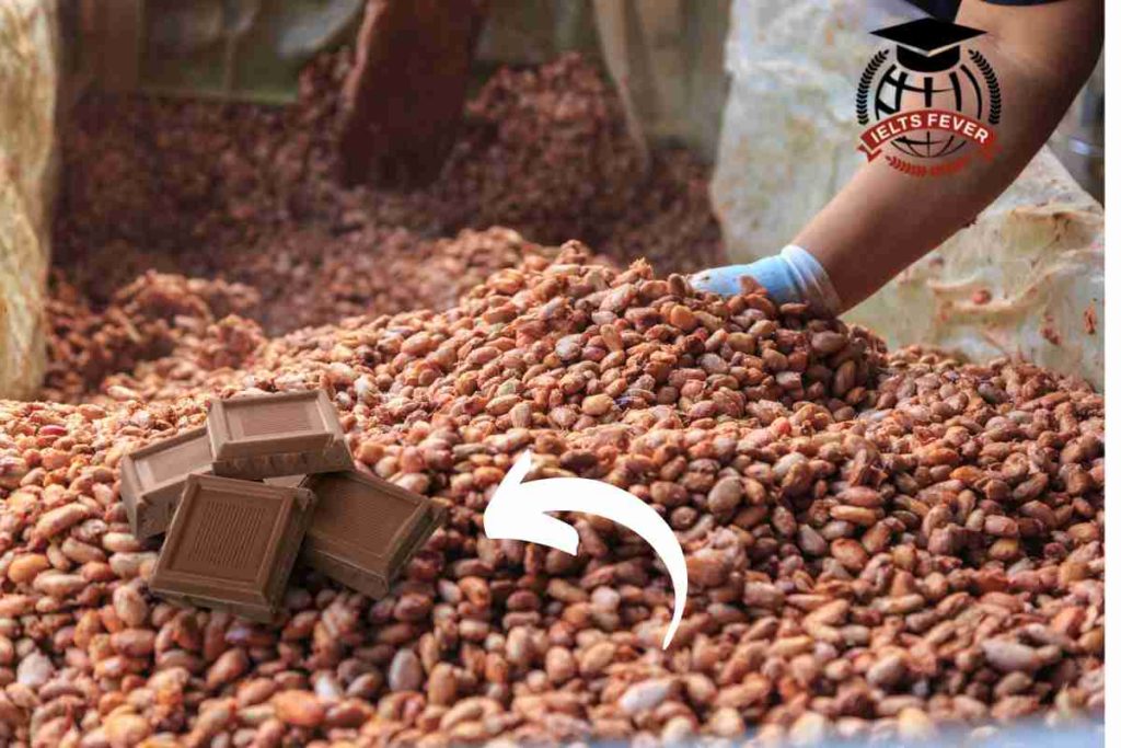
The illustrations show how chocolate is produced. The chart illustrates the manufacturing of chocolates. Overall, it is immediately apparent from the chart that there are a total of 10 stages to producing chocolates, beginning with the ripe pods collected from cocoa trees and culminating in liquid chocolate produced. In detail, ripe red pods have been

The Illustrations Show How Chocolate is Produced. Ac Writing Task 1 Read More »

The Bar Chart Shows the Monthly Spending in Dollars of A Family in The USA

The Bar Chart Shows the Monthly Spending in Dollars of A Family in The USA (1)

The bar chart shows the monthly spending in dollars of a family in the USA on three items in 2010. The bar chart illustrates dollars consumed by families in three different categories in four months in 2010. Overall, it is immediately apparent from the chart the highest monthly expenditure by the family in the US

The Bar Chart Shows the Monthly Spending in Dollars of A Family in The USA Read More »

The Bar Chart Shows the Number of Times per Week (in 1000s), Over Five Weeks

The Bar Chart Shows the Number of Times per Week (in 1000s), Over Five Weeks

The bar chart shows the number of times per week (in 1000s), over five weeks, those three computer packages were downloaded from the internet. Sample 1 The Bar Chart Shows the Number of Times per Week (in 1000s), Over Five Weeks The given bar chart represents the information regarding downloading computer packages from the internet

The Bar Chart Shows the Number of Times per Week (in 1000s), Over Five Weeks Read More »

The Pie Charts Show the Main Reasons for Migration to And from The Uk in 2007.

The pie charts show the main reasons for migration to and from the UK in 2007. Sample Question for The Pie Charts Show the Main Reasons for Migration to And from The Uk in 2007. The Pie chart shows the information reasons for people migrating to and from the UK in 2007. At a Glance,

The Pie Charts Show the Main Reasons for Migration to And from The Uk in 2007. Read More »

The Line Graph Illustrates the Number of Spreads Consumed from 1981 to 2007 in Grams

The line graph illustrates the number of spreads consumed from 1981 to 2007 in grams. Sample Question for The Line Graph Illustrates the Number of Spreads Consumed from 1981 to 2007 in Grams The chart illustrates the utilization of spread in grams by individuals over 26 years. Overall, it is immediately apparent from the chart

The Line Graph Illustrates the Number of Spreads Consumed from 1981 to 2007 in Grams Read More »

The Graph Below Shows the Fishing Industry in A European Country According to Four Indicators

The graph below shows the fishing industry in a European country according to four indicators. Summaries the information by selecting and reporting the main features, and making comparisons where relevant. The given table illustrates the data of big-scale industrial ships and small-scale fishing boats involved in the European fishing industry. It is fascinating to see

The Graph Below Shows the Fishing Industry in A European Country According to Four Indicators Read More »

The Charts Below Show the Number of People in Europe Who Were Affected by Four

The Charts Below Show the Number of People in Europe Who Were Affected by Four (1)

The charts below show the number of people in Europe who were affected by four types of noise by day and by night in cities and rural areas in 2007. Summarise the information by selecting and reporting the main features and make comparisons where relevant. The bar graphs depict the number of people in the

The Charts Below Show the Number of People in Europe Who Were Affected by Four Read More »

Scroll to Top