The charts below show local government expenditure in 2010 and 2015. Summarise the information by selecting and reporting the main features and make comparisons where relevant.
Sample Answer of The Charts Below Show Local Government Expenditure in 2010 and 2015.
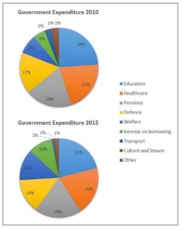
The pie chart depicts indigenous authority money utilization between 2010 and 2015 on diverse kinds of facilities.
In 2010 maximum expenditure was incurred on the study system which remained on peek in 2015, even though it decreased by 3 percent compared to 2010. At the same time, money spent on welfare was inclined by 4 percent within half a decade. Money expended on Defense and healthcare was decreased by 3 percent and 1 percent, respectively.
Furthermore, Money utilized on Interest on borrowing increased by 5 percent in 2015. At the same time money spent on transportation and Culture and leisure activities was declined by 2 percent and 1 percent respectively. On the other hand, the ratio of money utilized on pensions and others observed remain the same.
Overall the maximum fall was noticed in the ratio of education and Defense. In comparison, the maximum increased ratio was seen on the rate of interest.
Also, Read
Describe a Family Which You Like and Are Happy to Know
Discover more from IELTS Fever
Subscribe to get the latest posts sent to your email.