The Graph Below Shows how Elderly People in The United States
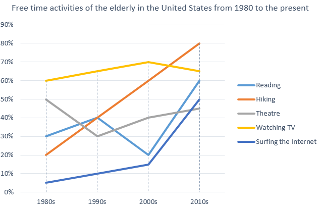
The graph below shows how elderly people in the United States spent their free time between 1980 and 2010. Summarise the information by selecting and reporting the main features, and make comparisons where relevant. The graph represents the spending of free time of elderly people in the United States in the year of 1982 to […]
The Graph Below Shows how Elderly People in The United States Read More »