The chart below shows the number of men and women in
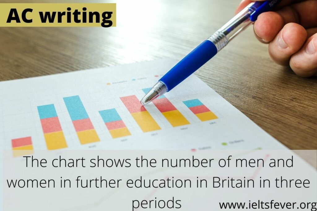
The chart below shows the number of men and women in further education in Britain in three periods and whether they were studying full-time or part-time. Summarise the information by selecting and report in the main features, and make comparisons where relevant. Write at least 150 words sample answer: INTRODUCTION: The bar chart represents the […]
The chart below shows the number of men and women in Read More »